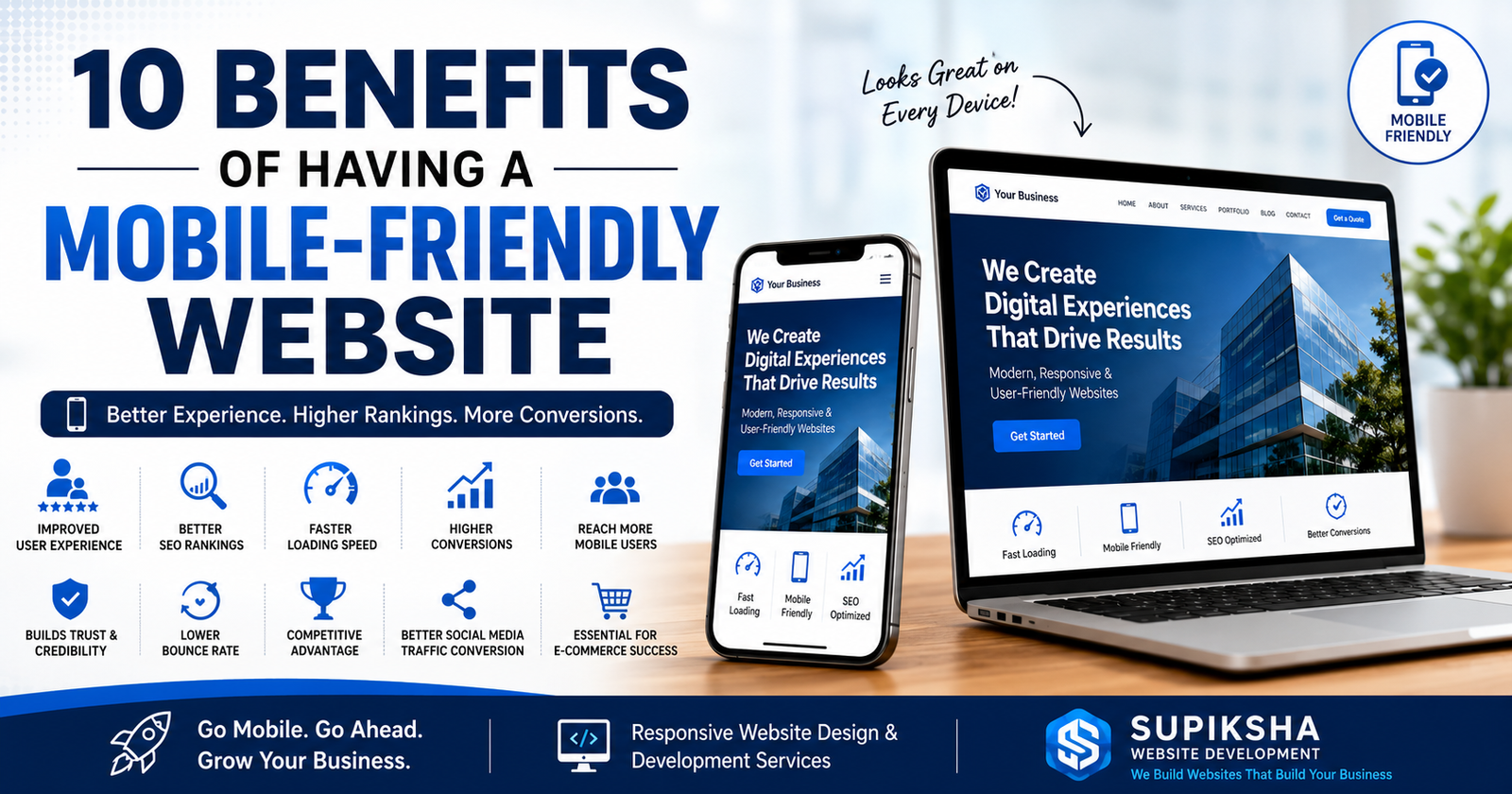
10 Benefits of Having a Mobile-Friendly Website for Your Business
Smartphones have changed the way people browse the internet. Today, most users search for products, services, and businesses using their mobile devices. Whether someone wants to find a nearby restaurant, book a hotel, purchase products online, or hire professional services, they usually begin with their smartphone.
This shift has made mobile-friendly websites more important than ever. Businesses that fail to provide a seamless experience on mobile devices risk losing potential customers and falling behind competitors.
If your website is difficult to navigate on smartphones, loads slowly, or requires excessive zooming, visitors are likely to leave and look elsewhere. This is why investing in responsive website design and professional website development is essential for long-term growth.
Let's explore the top benefits of having a mobile-friendly website and why every business should prioritize responsive website development.
What Is a Mobile-Friendly Website?
A mobile-friendly website automatically adjusts its layout, images, content, and navigation to fit different screen sizes, including smartphones and tablets. Users can easily read content, click buttons, browse pages, and complete actions without unnecessary zooming or scrolling.
Responsive website design ensures that your website delivers an excellent experience regardless of whether visitors use desktops, laptops, tablets, or smartphones.
1. Improved User Experience
User experience is one of the most important factors that determine whether visitors stay on your website or leave immediately.
A mobile-friendly website offers:
- Easy navigation.
- Readable text.
- Fast page loading.
- Optimized images.
- Clickable buttons.
- Smooth browsing experience.
When users enjoy browsing your website, they are more likely to stay longer, explore your services, and become customers.
2. Better Google Rankings Through SEO
Google uses mobile-first indexing, meaning it primarily evaluates the mobile version of your website when determining search rankings.
Businesses with responsive and SEO-friendly websites are more likely to rank higher for keywords such as:
- Website development company
- Professional website designer
- Business website development
- Responsive website design services
- Custom website design
- SEO-friendly website development
- Affordable website development services
- E-commerce website development
- Website redesign services
A mobile-friendly website improves search engine optimization and helps attract more organic traffic from Google.
3. Faster Website Loading Speed
Website speed plays a critical role in customer satisfaction and conversions.
Studies show that visitors often leave websites that take more than a few seconds to load.
Responsive website development focuses on:
- Optimized images.
- Efficient coding.
- Reduced loading times.
- Better performance across devices.
A faster website creates a better experience and improves customer retention.
4. Increased Conversion Rates
The ultimate goal of a website is to convert visitors into customers.
A mobile-friendly website makes it easier for users to:
- Submit inquiries.
- Contact your business.
- Purchase products.
- Book appointments.
- Request quotations.
- Subscribe to newsletters.
When customers can easily complete actions, your conversion rates increase significantly.
5. Reach More Mobile Users
More than half of global internet traffic comes from smartphones.
Consumers rely on mobile devices for:
- Online shopping.
- Service searches.
- Restaurant reservations.
- Travel bookings.
- Reading blogs.
- Watching videos.
- Comparing products.
If your website isn't optimized for mobile users, you are potentially losing a large portion of your audience.
6. Builds Trust and Professional Credibility
First impressions matter.
A professional website with responsive design immediately creates trust and confidence among visitors.
Customers often associate:
- Modern websites with professionalism.
- Fast loading pages with reliability.
- Responsive layouts with quality services.
A poorly designed website can make potential customers question the credibility of your business.
7. Lower Bounce Rate
Bounce rate refers to the percentage of visitors who leave your website without interacting with it.
Common reasons for high bounce rates include:
- Slow loading speed.
- Poor navigation.
- Small text.
- Unresponsive design.
- Difficult-to-click buttons.
A mobile-friendly website keeps users engaged and encourages them to explore more pages.
8. Competitive Advantage
Many small businesses still use outdated websites that are difficult to navigate on mobile devices.
By investing in responsive website design services, your business can stand out from competitors and provide a better customer experience.
Customers naturally prefer businesses that make browsing simple and enjoyable.
9. Better Social Media Traffic Conversion
Most social media users access Facebook, Instagram, LinkedIn, and YouTube through smartphones.
When visitors click your links from social media, they expect a smooth experience.
A mobile-friendly website ensures that traffic coming from:
- YouTube
can easily navigate your website and become leads or customers.
10. Essential for E-Commerce Success
For online stores, mobile responsiveness is critical.
Customers expect to:
- Browse products.
- Add items to carts.
- Complete payments.
- Track orders.
- Read reviews.
without any difficulty.
Professional eCommerce website development focuses heavily on mobile optimization to maximize sales and customer satisfaction.
Industries That Benefit From Mobile-Friendly Websites
Almost every industry benefits from responsive website design, including:
- Local businesses.
- Retail stores.
- Restaurants.
- Hotels.
- Healthcare providers.
- Educational institutions.
- Manufacturers.
- Consultants.
- Freelancers.
- Real estate agencies.
- E-commerce stores.
- Startups.
Why Responsive Website Design Matters for SEO
Responsive websites provide several SEO advantages:
- Improved page speed.
- Lower bounce rates.
- Better user experience.
- Higher engagement.
- Increased dwell time.
- Mobile-first indexing compatibility.
These factors help websites rank better in search engines and attract more potential customers.
Why Choose Supiksha Website Development?
At Supiksha Website Development, we specialize in creating modern, responsive, and SEO-friendly websites that perform perfectly across all devices.
Our services include:
- Business website development.
- Custom website design.
- Responsive website design services.
- SEO-friendly website development.
- E-commerce website development.
- Corporate website development.
- Portfolio website creation.
- Landing page development.
- Website redesign services.
- Affordable website development services.
We focus on creating websites that not only look attractive but also generate leads, improve search rankings, and help businesses grow online.
Final Thoughts
In today's mobile-first world, having a mobile-friendly website is no longer a luxury—it is a necessity.
A responsive website improves user experience, boosts SEO rankings, increases conversions, builds trust, and helps businesses stay ahead of competitors.
If you want to grow your business online and provide the best experience for your customers, investing in professional responsive website development is one of the smartest decisions you can make.
Supiksha Website Development helps businesses create fast, responsive, and SEO-friendly websites that drive long-term success and sustainable growth.
If you're looking for affordable website development services, visit Supiksha Web Development. ```